I have held multiple job titles tech writer, developer, information architect and currently UX designer. Underlying all the job titles and skill sets is general problem solving ability that was needed to succeed. Here are three techniques that I have personally found very useful in improving my problem solving abilities.

Essential and Accidental Complexity

In the famous No Silver Bullet essay, Fred Brooks discussed two types of complexity that impact software development productivity. (Brooks attributes the original idea to Aristotle)

  1. Essential complexity is complexity that can’t be reduced further. These are the difficulties in the requirements that are unchanged by the implementation.

  2. Accidental complexity is complexity introduced during implementation. These are side effects of solving a problem.

I find this very useful to understand software requirements. Essential complexities come from users, organizations or society at large. Consider tax filing software as an example. The tax codes are the essential complexity. They are laws set by the government. From a software’s perspective they can’t be simplified further. But the accidental complexity, like saving user input, is under the software team’s control. If a problem will be not be present in another implementation medium then it is an accidental complexity. In the case of tax filing software, another medium is using a real accountant to file taxes. Will an accountant ask if you want to save your information when you leave her office?

For designers, solving essential complexity is usually more valuable than solving accidental complexity. User’s feedback often points at implementation details like “I want a button that will do x”. A good designer should distill the feedback to its essential complexity and then solve it. The best interface is no interface.

Known unknown

Software projects are about reducing uncertainty. When a project starts there is a lot of uncertainty. By means of research, discussions, mockups, prototypes and software, information is uncovered and the uncertainty progressively decreases. A framework to track the information space around a software project will be helpful.

Donald Rumsfeld popularized the idea of partitioning our understanding of the world into four quadrants. When I started hearing references to “known unknowns”, I assumed they were sarcastic comments. It took me a while to realize its benefit. I find it especially useful for thinking about user research. The four quadrants are:

  1. Known-knowns. Things I know that I know.

  2. Known-Unknowns. Things I know that I don’t know. I know the identifier or label of the data point, but I don’t know the data point. This is a manageable information space. Once I know the label then I can take proper efforts to uncover the data. Quantitative research methods are the right methods for tackling this area since I know what I’m are measuring.

  3. Unknown-unknowns. Things I don’t know that I don’t know. At the beginning of a projects, I’m starting from this quadrant. Qualitative methods are the right methods for tackling this area since they yield richer information.

  4. Unknown-knows. Rumsfeld didn’t use this category, but it can be derived. Things I forget that I know. Sometimes I forget take into account something that I already know.

Stephen Covey – Urgent/Important

Like most people, I have a running to-do list. I found that how I structure and order the tasks in my list determines which task I will do next. A common trap for me was spending more time on easy but less valuable tasks. Or working on tasks at the top of the list and realizing that a more urgent task is at the bottom of the list.

After I read Stephen Covey’s Seven Habits of Highly Effective People book, I started following his recommendation of dividing tasks based on urgency and importance. This technique makes me vigilant by organizing tasks based on what I value as importance. Instead of using four quadrants as he prescribes, I use two categories – urgent and important. Most of the time the urgent tasks are not important and important tasks are not urgent.

My goal is to spend more time on important tasks, since they are more fulfilling. Urgent tasks can’t be eliminated completely. But having all tasks in the urgent bucket is a sign of reactive work mode. I consciously try to spend some time on important tasks, even if I have a lot of urgent tasks. When I have no more important tasks, it is a signal that I have to start some initiatives to solve problems that I’m passionate about.

The Mazda MX-5 is the best-selling two-seat sports car. It is famous for being light weight and fun to drive. Mazda follows the principle of Jinba ittai, Japanese for horse and rider being one, while developing the car. The principle comes from the Japanese sport of mounted archery, where the rider controls the horse with his knees. This principle has guided Mazda to create a car that is known for its driving experience and not its features.

Design Principles

Designing is the act of making choices. Design principles guide us in making decisions. In that process, they also become the criteria for evaluating the decision made. In projects riddled with ambiguity and fuzzy goals, design principles are a good antidote.

There are two different usages of the phrase ‘design principle’. One school of thought is principles in using visual medium like line, shape, and color. I’m using ‘design principle’ as a more general rule that is understood and followed by anyone. (Just principle is more accurate, but I like the sound of design principles.)

Collaboration tool

“If you know where you’re going, it doesn’t matter how fast you get there.” Jared Spool

In large projects, communication within the team is a major bottleneck. Especially in globally distributed teams, conventional modes of communications like meeting and email are limiting. There will be only limited timeframe for meetings due to timezone differences. And everyone is overloaded with email these days. In effect, the amount of information communicated within the team is finite.

Design principles bring all the team members to an agreement about the goal and perhaps the strategy to reach the goal. This is so much better than agreeing to the solution. This will allow the team members to work independently while still maintaining a common goal. As team members work around the same design principles over time, mutual trust will increase and the amount of information communicated to get the same task done will decrease.

Choosing design principles

Selecting design principles is difficult, because there is no right or wrong principle. But it is an important conversation to have with oneself and with team members. Conflicts about the principles can also be harder to resolve for the same reason. However, if these conflicts are not resolved or even acknowledged up front, they can become painful and tedious later.

Bret Victor gave an inspiring talk on choosing a career based on a principle. In the talk he gave two qualities needed in a principle:
* It should be actionable. Phrases like ‘keep it simple’, ‘easy to use’, ‘beautiful’ are ambiguous. And can’t be acted upon.
* It should also objectively divide a situation into right or wrong.
I will add that the design principles should not point to solutions. They should show the way. So choose any principle that has these qualities, and make sure everyone buys into it.

Design principles don’t guarantee success. At the least, it guarantees clarity of thought which I think is better than success.

Learning is a nonstop process. Since graduating from Michigan three years ago, I have learned as much as I did in school. These are some lessons that were the most revealing and useful to me.

Design has to complement business and technology

I used to think a product can succeed solely based on its design. Any decent idea, with a good user interface will result in a successful product. In other words, I had a hammer and every problem looked liked a nail to me.

Don Norman argued that technology has to advance first for innovative breakthroughs. Design research is needed for identifying incremental improvements to existing solutions. But with just design alone we can’t go very far. His message signaled me to get out of my tribal mentality. And realize that design alone is not sufficient for success. It is important to understand the value that technology is bringing to the product. Even as someone who likes to code, this was revealing.

Good business strategy is the third ingredient in successful products. I admire a lot of products that are not commercial successes. Palm pre had some amazing design details that iOS and Android took many years to implement. But it didn’t have the right business strategy and technology. Design has to work with the business strategy. If the business strategy is to increase the sales within the existing customer base, then a completely revamped interface would not work well. I need to understand how the product I’m working on will generate revenue, directly or indirectly.

Everyone doesn’t know design

During grad school, I was surrounded by deadlines, wannabe designers, sticky notes, and MacBooks (in that order). It didn’t occur to me that one day I will work with people who don’t know design. When I started working, I was looking for opportunities to use phrases like contextual inquiry, fitts law, short term memory in my sentences. I think people were polite when they ignored me when I tried too hard.

There is definitely an increasing appreciation for design and usability in the industry. But non-designers don’t speak the design lingo; and I don’t think they have to. It would be useful, but I can’t assume it. This realization changed how I communicate with people. When I start working with someone for the first time, I explain my process in simple terms. While presenting solutions, I explain it from the user’s perspective, instead of a designer’s perspective. Just like physicians who explain how our body works and what went wrong to help the patient understand the situation.

All problems are not equally important

Our lives get more complicated as we grow up. As kids we don’t have todo lists and projects. At some point we start organizing our lives. A similar evolution happened in my approach to problem solving.

I used to focus my energy equally on every aspect of a project. It is so easy to get stuck at designing the signup page. It is an interesting problem, but it is not valuable. Now I get the lay of the land, identify the value of each step and allocate my energy proportionally. Or I try to do this. But prioritization is a skill that takes a lot of practice and I just got started. As I learn to pick my battles, may the odds be ever in my favor.

Fundamentals of design are timeless

Technology has been evolving rapidly. Last year’s technology is already obsolete. I tended to think technology problems are unique to our times. When I was a developer this assumption was correct. Often the issues are specific to the programming tool. As a designer I continued this mindset, getting my information mostly from RSS feeds, Twitter, latest products. I was interested in only the latest and greatest design soutions, thinking, process, etc.

Subconsciously I was trying to follow the current trends in my design solutions. As a result, I would not be able to explain all my design choices. Fortunately, I also read some good books, in addition to online content. As I followed the trail of references from books I liked, I developed a better understanding of the basics of design. Cognitive Psychology especially has given me lot of reliable concepts.

I still catch-up with the latest developments and get inspired by them. But I’m more aware of my design decisions and reasons behind them. Here are the influential books I have read recently that are at least a decade old.

  • The Humane Interface taught me about the perils of software mode, designing for short term and long term memory.
  • Designing Visual Interfaces, 1994, presents user interface design as a communication problem.
  • Semiology of Graphics, originally published in 1967. I’m still reading the book. The theory in the book has given me a very reliable structure to analyze data and map it to a visualization method. Can’t recommed this book enough.
  • The Mythical Man Month. This book is about software development. I promise you that most of the examples in the book will be familiar to anyone who has gone through a software release cycle.

Discrimination is the prejudicial treatment of an individual based on their membership – or perceived membership – in a certain group or category. – Wikipedia Apr-20-2012

Most software development teams are composed of product managers, designers and developers. For the sake of  simplicity, lets assume that the designer is also the product manager. So the designer has the vision and the developer builds it. A similar division of labor can be seen in other fields too like manufacturing, and architecture – where one group envisions and the other group builds the vision. Which makes me suspect that the current structure in the software product teams is inherited from the manufacturing era.

Divide and suffer

As someone who loves to design and code, it pains me to see how designers and developers have become entrenched  within their roles. Each group has a natural tendency to be dismissive of the other group’s concern. This creates a mindset that any input from a designer will increase development cost. Similarly any interface designed by developers will have usability issues. I think the current design and development tools are reinforcing these stereotypes and keeping teams unproductive.

I have used design tools like Adobe Fireworks, Omnigraffle, Balsamiq etc. They are basically bitmap or vector drawing tools. They have some features for UI design, like creating clickable images. But I think they are all fundamentally flawed. The main problem is that these tools make designers and developers works in separate silo. Any design has to be constructed from a blank canvas. It becomes useless after the idea has been communicated to the developer. The developer has to now build from scratch; the efforts of the designer seems useless. This is obviously inefficient but more importantly it prevents software teams to bridge the designer/developer chasm. Team members can’t help each other even if they want. So the team members’ goals are aligned with their roles rather than with the product or the service.

Future is even scarier

The problem is more serious when we think about the transition to a responsive design movement, where the interface can respond to anything. My favorite  responsive design is the XKCD April 1st comic. The you will see a  comic based based on your geographic location, browser and window size (there could be more parameters). Imagine creating an user interface that reacts usefully to so many parameters. Using the traditional process and tools, designers have to create an order of magnitude more deliverables. I would rather pick apples.

Bits and pieces

I don’t know what is the solution to this problem. I do believe that software development platform has to be designed to be a more collaborative environment from the ground up. I have seen some ideas that seem like a step in the right direction.

The model-view-controller framework separates the data (model), interface (view) and logic (controller) . This allows people concerned with interface to work more independently. Increasingly many web application are being written using this approach. The idea was first proposed in 1979. But it has become popular only the last 7 years. Technology might change fast, but culture and process evolve painfully slow.

Within the interface itself an UI framework like Bootstrap can be a good shared resource between designers and developers. It allows designers to create building blocks which can be used without any additional effort to build. One of the designers behind the framework explained that Bootstrap was created by a group of designers and developers to “quickly build stuff”. Frameworks have been around for a long time. But this is the first framework, which I know, has been created jointly by developers and designers. The framework has to be accessible to everyone. If one group controls it, then it naturally breeds mistrust.

Firebug and Inspector tool in Chrome are one of my favorite tools. They give very easy access to the code and any changes are immediately seen. So I can play with colors, layouts  and even interactions. I can be reasonably  certain that the solution will work. There is still the barrier of the learning HTML/JS/CSS to use these tools. Which is why I think we need more languages and development tools that are designed to be easy to read and understand. Ruby is a very readable and accessible language. It was designed based on principles of UI design. But I think we can much farther.

I hope more tools likes these continue to be created to improve collaboration and change team dynamics. We are only at the dawn of the digital age. Let a million languages and tools bloom.

Question everything generally thought to be obvious - Dieter Rams

I think Google Chrome has one of the most elegant interfaces. When it was launched, I didn’t understand the need for another web browser. But as I started using the new browser, it changed me as user and as a designer.

It showed that minimal does not mean less functionality. It also showed the importance of focusing on content above all else. Even if it means eliminating or customizing standard OS elements like titlebar and scrollbar which take up precious real estate.

There are many innovative design details in Chrome, like the tab close behavior. I really like the Find in Page feature. It is the same text search feature that is found in almost any software that displays text. You would think that by now the feature would be perfected. Chrome has very elegant solution which is better than existing implementation. It also captures its design philosophy.

Position and size

Let us see how other browsers implement this feature. Firefox and Safari show the the ‘find bar’ as one row; the former at the top of the screen and latter at the bottom. Displaying the find bar at the top is better for readability. After typing the query the user can start scanning the page from top to bottom. Otherwise, nothing really interesting about them.


Since every piece of UI was questioned by the Chrome team, the find bar, appears in the top right corner taking only the amount of horizontal space it needs. Chrome’s find bar uses only icons for previous, next and close actions. The box is positioned in the top left corner. Since content flows from left to right (with exceptions), the left side is more important for legibility than the right side.

Chrome does not have Firefox’s Match case and Highlight all options, which helps it to trim fat. These options will be useful in some circumstance. But I don’t think they are necessary for the find feature in a web browser. Also they distract the user from the actual task.


Tracking matches

Even with its small foot print, Chrome’s find bar show the total number of search results and the position of the highlighted. Firefox and Safari in spite of taking the whole row don’t show this information.The text highlight moves automatically as the user types in the find box. The position of the current highlight amongst the total number of matches in shown right next to

The number of matching text will help  the user decide how much search string to type.

Scroll Bar

Scroll bars is one of the least useful UI controls, especially for the amount of screen real estate it takes. Unfortunately it is needed in a desktop UI with keyboard mouse interaction. Chrome has special scroll bar that has one more utility. It shows the location of the matching text in the page.

More than the usefulness of the feature, what I admire is that the feature does not take any more space. In fact it adds value to space that is otherwise wasted.

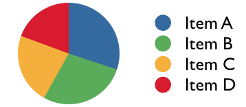
Pie charts are not a good  choice to communicate a group of numbers, because humans can’t compare area as good as length. Even if comparing values is not important, I think there are layout and readability problems with pie charts.

There are two ways to add legends to a pie chart. One method is to list each color and the name of the variable. This design has poor readability. The reader has to move back and forth between the pie chart and legend to read the chart.

A better design is to label each section in chart directly, obviating the need for a chart. This is definitely better to read. But the layout can be unpredictable. If the data is skewed then a lot of labels might overlap. For interaction designers, we don’t always know the data before hand. So using this type of chart will make the design unpredictable.

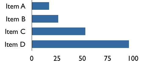
I think a simple bar chart is more effective than pie chart. A horizontal bar chart can be treated like a table. The data can be presented in an sorted order, which makes reading a more pleasant experience. Only one color is needed in the chart, which reduces unnecessary contrast.

Should labels and messages in an user interface be in first person or third person voice? For example, in an email client should the contacts be called “My Contacts”, or “Your Contacts”? Of course we can call it just contacts. But the point is if the UI has to refer to the user should it be in first person or third person? I think first person is suitable for navigation, labels, and other short phrases. But for sentences like error messages, and confirmation messages third person voice is more suitable.

An uxmatters.com Q&A on this topic suggests first trying to use just the noun. If that is not possible, then use first person voice (My Contacts) since it makes the experience more personal. Third person voice can also be used when the application has an instructional tone example like a learning software.


I have been working on icons recently. This is the first time I’m responsible for designing icons.  So I have been learning design principles related icons. In the last post, I wrote about the three types of icons/signs and theory of semiotics. This helped me to identify what to use as the icon. The next step was creating the actual icon. I always imagined creating icons as a very artistic activity and requires a mastery of an illustrating tool. But I learned that by following some basic principles I can create the right icons that are simple to create.


Show only the required details

Icons help users recognize a class of object. This AIGA icon for example can be instantly recognized as a bus. The icon does not show many details like rear view mirrors or grills. But they are not going to make the user recognizer the icon any faster. In fact it may increase the time to recognize since the user has to process more information. So once I selected the object to be used as an icon, reduce the object to its most basic elements. This reduced the amount of work I had to do.


Design icon in the size they will be used

I wanted icons at 16x16px. Our team a had purchased a library of vector icons, which could be scaled to any size. But when I reduced them to 16×16 px many details of the icons got distorted and the icons were not legible. So I created bitmap icons at 16x16px, either from a blank slate or retouching the vector icon at the required size. Vector icons don’t always get distorted, but I think there is a range of sizes beyond which a icon looks distorted.


Contrast across icons

It is important that icons are distinguishable from each other especially if icons are going to be shown next to each other. Otherwise the user would take longer time to recognize the icons, which defeats the whole purpose of icons. Whenever I have to design for contrast, I refer to Bertin’s retinal variables: Hue, Shape, Texture, Orientation, Size & Value.

Since all icons have to be similarly sized, I could not use size and position for showing contrast. But using only shape, hue, and orientation I could show sufficient contrast across the icons. I didn’t use texture, since it would be harder to perceive texture at small sizes and also it needs more illustrating skill.

Google’s icons are a good example of  icons having contrast across hue, shape and orientation. I like how the icons for Blogs and Realtime have the same shape, but different hue and orientation. It captures their conceptual similarity and differences beautifully.

Icons are visual representation of actions, objects or concepts in an user interface. They make use of our ability to quickly recognize visual patterns and memorize them. It is not possible for us to not recognize a visual pattern that is stored in our memory.Icon is an commonly used term in user interface design field; a more generic term would be sign. Signs have been used and studied for a long time. Semiotics is the study of signs and how people interpret signs. Charles Sanders Pierce, regarded as the founder of Semiotics, classified signs into three types.

1. Icon, or likeness: This is a sign that is a direct imitation of the concept. For example, photograph of a person’s face in a contacts list would be a icon. Similarly a graphic of the iPhone is technically an icon. In user interface the term icon is used instead of a more accurate term signs because when signs were first used in user interfaces they were all mostly icons. Early icons were imitation of a objects in office environment like document, folder, printer.

2. Index or indications: This is a sign that shows a symptom or evidence of a concept. For example, emoticons :-)are an indication of emotions. While using index, designer has to make sure that the correlation between the index and the concept can be made by the user. Document and image editing programs use index signs (bold, right align) to represent the result of using a tool.

3. Symbols: This is a sign that becomes associated with the  concept by usage over time. Numbers and alphabets are the best examples of symbols. Icons and indices can become symbols over time by repeated usage. The floppy disk image is now commonly used to indicate save operation, although floppy disks are almost extinct.

It is not possible to represent any concept with a sign. Abstract concepts like Save as, Print preview that have no resemblance in real world are hard to represent visually. It is safer to use a symbol with a label to represent such operations.

Purpose of presenting information is to help the decision making process.  Information presenters should have the spirit of whatever it takes to help the process. This was the premise of Edward Tufte’s workshop I attended in San Francisco on Dec 9.  Here are my notes from the workshop:

Data analysis

Information overload is caused by lousy design. Humans process huge volumes of data everyday.
The challenge is presenting multivariate data on a two dimensional surface like paper or screen.
Finding causality is the goal of data analysis. Unlike physical world where the causality is constant, in the human world causality is impermanent. In fact we look for causality to do an intervention and break the causal chain.
Design should support data comparison. Spatial adjacency is better than temporal adjacency for data comparison.

Information presenters

Presenting information is an intellectual and ethical activity.
Do not cherry pick data.
Respect your audience.
Know your content.
Your presentation should support an unguided cognitive walk through.

Information Consumers

Check the sources of information used in presentation.
Evaluate the competency of the presenter.
Is the result too good to be true?
Have an open mind but not an empty head.

Design Principles

Use the resolution of typography. Content is the design. Don’t put boxes around everything.
Treat design as a research problem rather than a creative problem.
To find examples of good visualization read scientific journals like Nature.
In design 1+1=3 . If two design elements are put next to each other, an interaction effect is added to the effects of the two elements.

User Interface Design

1st generation of interfaces was command line based, like DOS. Involved remembering and typing
2nd generation interfaces – GUI using windows and icons. Involved clicking and pointing
3rd generation is likely to be touch base high resolution
Computers separate information by mode of production. Users have to go to different application  “rooms” to work on different modes of production
In recovery.gov ET set a goal of using 92% of screen space for content

Overall Tufte gave a lot of food for thought. He showed a lot of good design examples from Galileo’s recordings of the sun spots to a SARS virus outbreak. But all his examples were static content or structurally static (like weather forecast). He picked examples where the designer knows the content exactly. This works well for board room presentations and publishing. But while designing a web application the content or even the structure of the content is not known to the designer. In my current project, I am designing an web application that can be customized by banks for their business needs. So the design has to be flexible for a wide range of requirements. In other words, web designers have to design web applications before there is any content, ergo we have to treat content and design separately. My main takeaway from the workshop was his spirit of “whatever it takes”.